Beginner Friendly & Modern UI Design
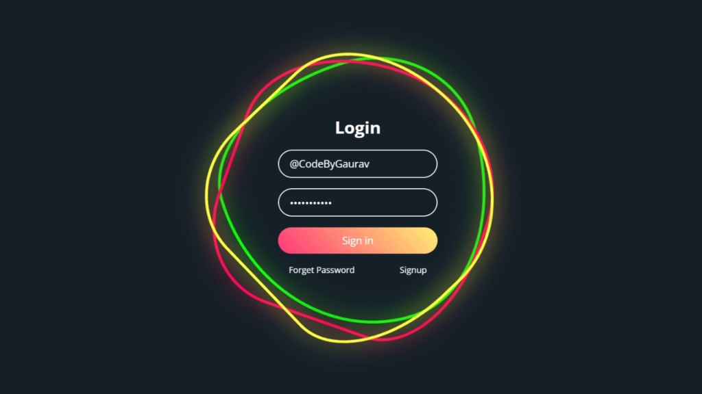
An Animated Login Form built using only HTML and CSS is a great way to create a clean and interactive user interface without relying on JavaScript. This project focuses on smooth CSS animations, hover effects, and responsive layout, making it perfect for beginners in frontend development.
Tools & Resources That Support My Web Development Work
Discover the exact hardware and services I use daily — from laptops and keyboards to hosting and domains.

1. Video Tutorial – Animated Login Form (HTML & CSS Only)
If you prefer learning visually, you can follow the step-by-step video tutorial where the animated login form is created using pure HTML and CSS.
In the video, you’ll learn:
HTML form structure
CSS animations and transitions
Hover and focus effects
2. HTML Structure – Login Form Layout
The HTML structure includes:
Login form container
Input fields (username & password)
Login button
The markup is kept clean and semantic to ensure better readability and SEO.
👇 Place your complete HTML code below this section.
					<!DOCTYPE html>
<html lang="en">
<head>
    <meta charset="UTF-8">
    <meta name="viewport" content="width=device-width, initial-scale=1.0">
    <title>Animated Login Form | CodeByGaurav</title>
    <link rel="stylesheet" href="style.css">
</head>
<body>
    <div class="square">
        <i style="--clr:#00ff0a;"></i>
        <i style="--clr:#ff0057;"></i>
        <i style="--clr:#fffd44;"></i>

        <div class="login">
            <h2>Login</h2>
            <div class="inputBx">
                <input type="text" placeholder="Username">
            </div>
            <div class="inputBx">
                <input type="password" placeholder="Password">
            </div>
            <div class="inputBx">
                <input type="submit" value="Sign in">
            </div>
            <div class="links">
                <a href="#">Forget Password</a>
                <a href="#">Signup</a>
            </div>
        </div>

    </div>
</body>
</html>
3. CSS Styling – Animation & Effects
CSS is the key part of this project. It is used to:
Create smooth hover and focus animations
Style input fields and buttons
Apply transitions and transforms
Make the form responsive
All animations are handled using CSS only, without any JavaScript.
👇 Add your complete CSS code here.
					@import url("https://fonts.googleapis.com/css2?family=Open+Sans:ital,wght@0,300..800;1,300..800&display=swap");

* {
    padding: 0;
    margin: 0;
    box-sizing: border-box;
    font-family: "Open Sans", sans-serif;
}

body {
    display: flex;
    justify-content: center;
    align-items: center;
    min-height: 100vh;
    background: #151f28;
}

.square {
    position: relative;
    width: 500px;
    height: 500px;
    display: flex;
    justify-content: center;
    align-items: center;
}

.square i {
    position: absolute;
    inset: 0;
    border: 1px solid #fff;
    transition: 0.5s;
}

.square i:nth-child(1){
    border-radius: 38% 62% 63% 37% / 41% 44% 56% 59%;
    animation: animate 6s linear infinite;
}

.square i:nth-child(2){
    border-radius: 41% 44% 56% 59% / 38% 62% 63% 37%;
    animation: animate 4s linear infinite;
}

.square i:nth-child(3){
    border-radius: 41% 44% 56% 59% / 38% 62% 63% 37%;
    animation: animate2 10s linear infinite;
}

.square:hover i{
    border: 6px solid var(--clr);
    filter: drop-shadow(0 0 20px var(--clr));
}

@keyframes animate {
    0% {
        transform: rotate(0deg);
    }
    100% {
        transform: rotate(360deg);
    }
}

@keyframes animate2 {
    0% {
        transform: rotate(360deg);
    }
    100% {
        transform: rotate(0deg);
    }
}

.login{
    position: absolute;
    width: 300px;
    height: 100%;
    display: flex;
    justify-content: center;
    flex-direction: column;
    align-items: center;
    gap: 20px;
}

.login h2{
    font-size: 2em;
    color: #fff;
}

.login .inputBx{
    position: relative;
    width: 100%;
}

.login .inputBx input{
    position: relative;
    width: 100%;
    padding: 12px 20px;
    background: transparent;
    border: 2px solid #fff;
    font-size: 1.2em;
    border-radius: 40px;
    box-shadow: none;
    outline: none;
    color: #fff;
}

.login .inputBx input[type="submit"]{
    width: 100%;
    background: #0078ff;
    background: linear-gradient(45deg, #ff357a, #fff172);
    border: none;
    cursor: pointer;
}

.login .inputBx input::placeholder{
    color: rgba(255,255, 255, 0.75);
}

.login .links{
    position: relative;
    width: 100%;
    display: flex;
    align-items: center;
    justify-content: space-between;
    padding: 0 20px;
}

.login .links a{
    color: #fff;
    text-decoration: none;
}
4. Key Features of This Login Form
Animated UI using only HTML & CSS
No JavaScript required
Clean and modern design
Beginner-friendly structure
Fully responsive
Conclusion
In this tutorial, you learned how to create an Animated Login Form using only HTML and CSS. This project is perfect for beginners who want to practice CSS animations and build modern UI components without JavaScript.
You can enhance this project by adding:
Floating labels
Gradient backgrounds
Glassmorphism or neumorphism styles
For more HTML & CSS UI projects, follow CodeByGaurav 🚀


Pingback: Responsive Footer Design using HTML & CSS (Beginner Friendly Tutorial) - CodeByGaurav
Loved your work brother. Keep it up
thank u so much for your feedback
Pingback: Glowing Neon Button using HTML & CSS - CodeByGaurav