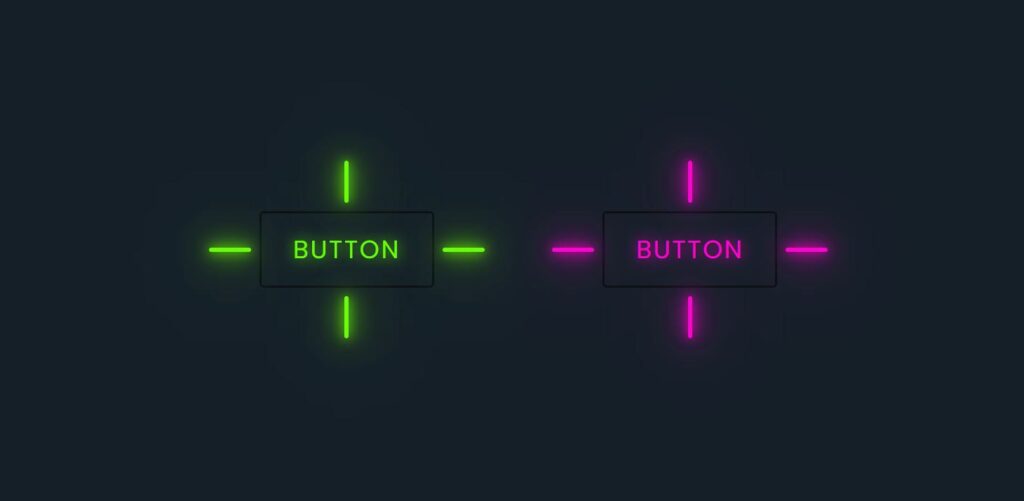
Button are an essential part of any website or web application.
Attractive button hover effects not only improve the visual appearance but also enhance user interaction and overall user experience.
In this project, we create modern and smooth button hover effects using only HTML and CSS, without using JavaScript.
This project is perfect for beginners as well as frontend developers who want to improve their UI design skills.
Tools & Resources That Support My Web Development Work
Discover the exact hardware and services I use daily — from laptops and keyboards to hosting and domains.

1. Video Tutorial – Button Hover Effects
To understand this project better, watch the complete video tutorial where button hover effects are explained step by step.
This video will help you see how hover animations work in real time and how simple CSS properties can create impressive UI effects.
2. HTML Structure for Button Hover Effects
The HTML part is used to create the basic structure of the buttons.
It defines the button elements and their layout on the webpage.
Below, you will find the complete HTML code used in this project.
You can copy and use it in your own projects or modify it according to your design needs.
👉 Full HTML Code Below
					<!DOCTYPE html>
<html lang="en">
    <head>
        <meta charset="UTF-8" />
        <meta name="viewport" content="width=device-width, initial-scale=1.0" />
        <title>Button Hover Effects || CodeByGaurav</title>
        <link rel="stylesheet" href="style.css" />
    </head>
    <body>
        <div class="container">
            <a class="button" style="--color: #6aff00" href="#">
                <span></span>
                <span></span>
                <span></span>
                <span></span>
                Button</a
            >

            <a class="button" style="--color: #ff00d0" href="#">
                <span></span>
                <span></span>
                <span></span>
                <span></span>
                Button</a
            >
        </div>
    </body>
</html>
3. CSS Styling for Button Hover Effects
CSS plays the most important role in this project.
All hover animations, transitions, colors, and effects are handled using pure CSS.
In the CSS section below, you will see how:
Hover effects are applied using pseudo-classes
Smooth animations are created using transitions
Buttons get a modern and professional look
👉 Full CSS Code Below
					* {
    padding: 0;
    margin: 0;
    box-sizing: border-box;
    font-family: sans-serif;
}

.container {
    width: 100%;
    min-height: 100vh;
    display: flex;
    justify-content: center;
    align-items: center;
    flex-wrap: wrap;
    gap: 160px;
    background: #151f28;
}

.button {
    position: relative;
    padding: 16px 30px;
    font-size: 1.5rem;
    color: var(--color);
    border: 2px solid rgba(0, 0, 0, 0.5);
    border-radius: 4px;
    text-shadow: 0 0 15px var(--color);
    text-decoration: none;
    text-transform: uppercase;
    letter-spacing: 0.1rem;
    transition: 0.5s;
    z-index: 1;
}

.button:hover {
    color: #fff;
    border: 2px solid rgba(0, 0, 0, 0);
    box-shadow: 0 0 0px var(--color);
}

.button::before {
    content: "";
    position: absolute;
    top: 0;
    left: 0;
    width: 100%;
    height: 100%;
    background: var(--color);
    z-index: -1;
    transform: scale(0);
    transition: 0.5s;
}

.button:hover::before {
    transform: scale(1);
    transition-delay: 0.5s;
    box-shadow: 0 0 10px var(--color), 0 0 30px var(--color),
        0 0 60px var(--color);
}

.button span {
    position: absolute;
    background: var(--color);
    pointer-events: none;
    border-radius: 2px;
    box-shadow: 0 0 10px var(--color), 0 0 30px var(--color),
        0 0 50px var(--color), 0 0 100px var(--color);
    transition: 0.5s ease-in-out;
    transition-delay: 0.25s;
}

.button:hover span {
    opacity: 0;
    transition-delay: 0s;
}

.button span:nth-child(1),
.button span:nth-child(3) {
    width: 40px;
    height: 4px;
}

.button:hover span:nth-child(1),
.button:hover span:nth-child(3) {
    transform: translateX(0);
}

.button span:nth-child(2),
.button span:nth-child(4) {
    width: 4px;
    height: 40px;
}

.button:hover span:nth-child(1),
.button:hover span:nth-child(3) {
    transform: translateY(0);
}

.button span:nth-child(1) {
    top: calc(50% - 2px);
    left: -50px;
    transform-origin: left;
}

.button:hover span:nth-child(1) {
    left: 50%;
}

.button span:nth-child(3) {
    top: calc(50% - 2px);
    right: -50px;
    transform-origin: right;
}

.button:hover span:nth-child(3) {
    right: 50%;
}

.button span:nth-child(2) {
    left: calc(50% - 2px);
    top: -50px;
    transform-origin: top;
}

.button:hover span:nth-child(2) {
    top: 50%;
}

.button span:nth-child(4) {
    left: calc(50% - 2px);
    bottom: -50px;
    transform-origin: bottom;
}

.button:hover span:nth-child(4) {
    bottom: 50%;
}
4. Why Use CSS Button Hover Effects?
Button hover effects help to:
Improve website UI/UX
Make buttons more interactive
Guide user actions visually
Increase user engagement
Give a modern and professional feel
These effects are widely used in portfolios, landing pages, and modern websites.
Final Conclusion
Buttons Hover Effects using HTML & CSS is a simple yet powerful frontend project.
With minimal code, you can create visually appealing buttons that greatly improve user experience.
This project is ideal for practice and can be reused in multiple real-world websites.

