Beginner Friendly & Fully Mobile Responsive Design
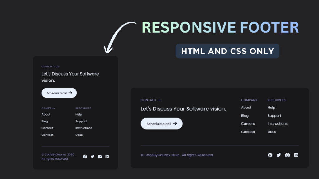
A footer is an essential part of every modern website. It helps users navigate important pages, connect with social media, and improves overall website credibility. In this tutorial, you will learn how to create a responsive footer using only HTML & CSS, without using any JavaScript.
This footer layout works perfectly on desktop, tablet, and mobile devices.
Tools & Resources That Support My Web Development Work
Discover the exact hardware and services I use daily — from laptops and keyboards to hosting and domains.

1. Video Tutorial – Responsive Footer Design
If you prefer learning visually, you can watch the video tutorial where the complete footer is designed step by step using HTML and CSS.
The video explains:
Footer HTML structure
CSS styling and layout
Responsive behavior for different devices
2. HTML Structure – Footer Layout
The footer structure is created using semantic HTML for better accessibility and SEO. Inside the footer, we include:
Website logo or brand name
Quick navigation links
Useful pages
Social media links
Below this section, you will find the complete HTML code that you can directly use in your project.
Tip: Always use the
<footer>tag for better SEO and clean structure.
<!DOCTYPE html>
<html lang="en">
<head>
<meta charset="UTF-8">
<meta name="viewport" content="width=device-width, initial-scale=1.0">
<title>Responsive Footer | CodeByGaurav</title>
<link rel="stylesheet" href="style.css">
<link rel="stylesheet" href="https://cdnjs.cloudflare.com/ajax/libs/font-awesome/7.0.1/css/all.min.css">
</head>
<body>
<footer>
<div class="top">
<div class="left">
<h2>Contact Us</h2>
<blockquote>Let's Discuss Your Software vision.</blockquote>
<button>
Schedule a call
<span class="symbols"><i class="fa-solid fa-arrow-right"></i></span>
</button>
</div>
<div class="right links">
<ul>
<li>
<h2>Company</h2>
<a href="#">About</a>
<a href="#">Blog</a>
<a href="#">Careers</a>
<a href="#">Contact</a>
</li>
</ul>
<ul>
<li>
<h2>Resources</h2>
<a href="#">Help</a>
<a href="#">Support</a>
<a href="#">Instructions</a>
<a href="#">Docs</a>
</li>
</ul>
</div>
</div>
<div class="bottom">
<div class="left">
<p>© CodeByGaurav 2026 . All rights Reserved</p>
</div>
<div class="right socials">
<i class="fa-brands fa-facebook"></i>
<i class="fa-brands fa-twitter"></i>
<i class="fa-brands fa-discord"></i>
<i class="fa-brands fa-linkedin"></i>
</div>
</div>
</footer>
</body>
</html>
3. CSS Styling – Making the Footer Responsive
CSS is used to style the footer and make it responsive. In this project, we use:
Flexbox for layout alignment
Media queries for mobile responsiveness
Hover effects for links
Proper spacing and typography
The CSS ensures that the footer adapts smoothly to different screen sizes without breaking the layout.
					@import url("https://fonts.googleapis.com/css2?family=Poppins:ital,wght@0,100;0,200;0,300;0,400;0,500;0,600;0,700;0,800;0,900;1,100;1,200;1,300;1,400;1,500;1,600;1,700;1,800;1,900&display=swap");

body {
    background: #232325;
    color: #e8f0fb;
    font-family: "Poppins", sans-serif;
}

:root {
    --color-primary: #908dcb;
}

* {
    box-sizing: border-box;
}

footer {
    position: fixed;
    left: 48px;
    bottom: 58px;
    right: 48px;
    padding: 48px;
    border-radius: 16px;
    background: rgb(0 0 0 / 30%);
    backdrop-filter: blur(20px);
}

.top, .bottom{
    display: flex;
    gap: 48px;
}

.top{
    margin-bottom: 24px;
}

.bottom{
    padding: 32px 0 0;
    align-items: center;
    border-top: 2px solid #2e2d42;
    gap: 24px;
}

.top:is(.left, .right){
    flex: 1 1 50%;
}

.bottom .left{
    flex: 1 1 auto;
}

h2{
    margin: 0 0 12px;
    font-size: 14px;
    text-transform: uppercase;
    letter-spacing: 1px;
    font-weight: 400;
}

h2, p{
    color: var(--color-primary);
}

p{
    margin: 0;
}

blockquote{
    padding: 0 24px 0 0;
    margin: 0 0 24px;
    font-size: 24px;
}

button{
    background: #e8f0fb;
    color: #000017;
    display: inline-block;
    gap: 8px;
    align-items: center;
    border: 0;
    border-radius: 40px;
    padding: 12px 24px 12px 28px;
    font-size: 15px;
    font-weight: 500;
    cursor: pointer;
    font-family: inherit;
}

button .symbols{
    font-size: 20px;
}

.links{
    display: flex;
    gap: 48px;
    padding-right: 48px;
}

ul{
    list-style: none;
    padding: 0;
    display: grid;
    margin: 0;
    flex: 1 1 50%;
}

ul li{
    display: flex;
    flex-direction: column;
    margin: 0 0 14px;
}

ul li a{
    text-decoration: none;
    color: #e8f0fb;
    margin: 0 0 14px;
}

.socials{
    display: flex;
    justify-content: flex-end;
    gap: 16px;
    font-size: 20px;
}

@media (width <= 734px){
    .top{
        flex-direction: column;
    }

    blockquote{
        padding-right: 0;
    }
}

@media (width <= 320px){
    .bottom{
        flex-direction: column-reverse;
    }

    .links{
        padding-left: 24px;
        padding-right: 24px;
        text-align: center;
    }

    .top .left{
        text-align: center;
    }

    blockquote{
        padding-left: 58px;
        padding-right: 58px;
    }
}
4. Project Overview :
The goal of this project is to design a fully responsive footer that works on all screen sizes.
The footer will include:
- Website logo or title
- Quick navigation links
- Contact information
- Social media icons
- Copyright text
On larger screens, the footer sections will be displayed in multiple columns. On smaller devices, the layout will stack vertically to maintain readability and usability.
This project demonstrates how to use modern CSS techniques like flexbox or grid to create responsive layouts.
5. Responsive Design Concept :
Responsiveness is an essential part of modern web development. A responsive footer ensures that the layout adapts to different screen sizes.
In this project:
- Desktop view shows multiple columns
- Tablet view adjusts spacing
- Mobile view stacks elements vertically
This ensures that the footer remains readable and user-friendly on all devices.
Using responsive design techniques improves user experience and helps your website perform better.
6. Practical Use Cases :
A responsive footer is used in almost every website.
Common use cases include:
- Portfolio websites
- Business websites
- Blogs and content websites
- E-commerce platforms
A well-structured footer helps users find important information quickly and improves website navigation.
7. You Might Also Like :
If you enjoyed this project, you may also like:
- Responsive Navbar with Dropdown Menu
- Glass Login Form using HTML & CSS
- Social Icons with Hover Effects
- Loading Animation using HTML & CSS
These projects will help you improve your frontend development skills.
8. Key Features of This Footer
Fully responsive design
Built using only HTML & CSS
Beginner-friendly and clean code
Modern and professional UI
Easy to customize for any website
Conclusion
In this tutorial, you learned how to create a responsive footer using HTML and CSS that looks great on all devices. This footer design is perfect for beginners and can be easily integrated into any website or project.
If you are learning frontend development or building your own website, this footer will help you improve both design and usability.
For more HTML & CSS projects and tutorials, follow CodeByGaurav 🚀


You have not created any header create header with responsive and 3d look primum effect and animation
check this full video: https://youtu.be/YXUMgCHNvU4?si=1cs36IBMUxOPO0E0