Introduction :
In modern web development, creating an engaging user interface (UI) is key to reducing bounce rates and increasing user retention. Flat and standard social media buttons are fast becoming outdated. Today, modern web design trends lean heavily toward Glassmorphism and 3D Micro-interactions.
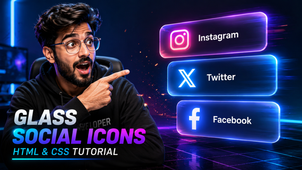
In this tutorial, we will show you step-by-step how to build interactive 3D Neon Glassmorphism Social Buttons using only HTML5 and CSS3—no JavaScript required!
Tools & Resources That Support My Web Development Work
Discover the exact hardware and services I use daily — from laptops and keyboards to hosting and domains.
🌟 Why Choose Glassmorphism UI?
Glassmorphism provides a modern, translucent aesthetic that makes UI components pop on dark backgrounds. Here are the key highlights of this project:
100% Pure HTML & CSS: Lightweight code that ensures your website loads at lightning speed.
Futuristic 3D Tilt Effect: Smooth perspective rotations on hover.
Dynamic Neon Glow: Customized color glow for each brand (Facebook, X/Twitter, Google, Instagram).
Responsive Layout: Works smoothly across mobile, tablet, and desktop screens.
AdSense & SEO Optimized: Clean code structure that improves user experience.
Video Tutorial :
You can watch the complete step-by-step tutorial below to understand how to build this Social Buttons Using Pure HTML & CSS.
🛠️ Step 1: HTML5 Markup (index.html)
We start by creating a clean semantic structure. We are using Font Awesome 6 to render high-quality social icons.
Add the following code into your WordPress code editor or custom template file:
					<!DOCTYPE html>
<html lang="en">
<head>
    <meta charset="UTF-8">
    <meta name="viewport" content="width=device-width, initial-scale=1.0">
    <title>3D Neon Glassmorphism Social Buttons</title>
    <!-- FontAwesome 6.5.1 Icon Library -->
    <link rel="stylesheet" href="https://cdnjs.cloudflare.com/ajax/libs/font-awesome/6.5.1/css/all.min.css">
    <link rel="stylesheet" href="style.css">
</head>
<body>

    <div class="glass-container">
        <!-- Facebook Button -->
        <a href="#" class="glass-btn facebook" style="--clr: #1877f2;">
            <div class="icon-box">
                <i class="fab fa-facebook-f icon"></i>
                <span class="text">Facebook</span>
            </div>
        </a>

        <!-- X (Twitter) Button -->
        <a href="#" class="glass-btn twitter" style="--clr: #1da1f2;">
            <div class="icon-box">
                <i class="fab fa-x-twitter icon"></i>
                <span class="text">Twitter</span>
            </div>
        </a>

        <!-- Google Button -->
        <a href="#" class="glass-btn google" style="--clr: #ea4335;">
            <div class="icon-box">
                <i class="fab fa-google icon"></i>
                <span class="text">Google</span>
            </div>
        </a>

        <!-- Instagram Button -->
        <a href="#" class="glass-btn instagram" style="--clr: #e1306c;">
            <div class="icon-box">
                <i class="fab fa-instagram icon"></i>
                <span class="text">Instagram</span>
            </div>
        </a>
    </div>

</body>
</html>
🎨 Step 2: Styling with CSS3 (style.css)
Now, let’s add the core styles. We use backdrop-filter for the frosted glass effect, perspective for 3D depth, and box-shadow for the neon aura.
Copy this code into your theme’s style.css file or WordPress Additional CSS section:
					* {
    margin: 0;
    padding: 0;
    box-sizing: border-box;
    font-family: 'Poppins', sans-serif;
}

body {
    display: flex;
    justify-content: center;
    align-items: center;
    min-height: 100vh;
    background: #0a0c14; /* Dark futuristic background */
    overflow: hidden;
}

/* 3D Perspective Container */
.glass-container {
    display: flex;
    gap: 25px;
    perspective: 1000px;
}

/* Base Glassmorphism Card */
.glass-btn {
    position: relative;
    width: 75px;
    height: 75px;
    background: rgba(255, 255, 255, 0.04);
    border: 1px solid rgba(255, 255, 255, 0.12);
    border-radius: 20px;
    text-decoration: none;
    display: flex;
    align-items: center;
    padding: 0 22px;
    backdrop-filter: blur(12px);
    -webkit-backdrop-filter: blur(12px);
    overflow: hidden;

    /* Smooth 3D Motion Transitions */
    transform-style: preserve-3d;
    transition: width 0.5s cubic-bezier(0.4, 0, 0.2, 1),
                transform 0.5s cubic-bezier(0.4, 0, 0.2, 1),
                box-shadow 0.5s ease,
                border-color 0.5s ease;
}

.glass-btn .icon-box {
    display: flex;
    align-items: center;
    gap: 18px;
    width: 100%;
}

.glass-btn .icon {
    font-size: 1.8rem;
    color: rgba(255, 255, 255, 0.6);
    min-width: 30px;
    display: flex;
    justify-content: center;
    align-items: center;
    transition: color 0.4s ease, transform 0.4s ease;
}

.glass-btn .text {
    color: #ffffff;
    font-weight: 600;
    font-size: 1.05rem;
    letter-spacing: 0.8px;
    opacity: 0;
    transform: translateZ(20px) translateX(-10px);
    transition: opacity 0.4s ease, transform 0.4s ease;
    white-space: nowrap;
}

/* --- Interactive 3D Lift & Glow Mechanics --- */

.glass-btn:hover {
    width: 200px;
    border-color: var(--clr);
    transform: translateY(-10px) rotateX(15deg) rotateY(-10deg) translateZ(10px);
    box-shadow: 0 20px 30px rgba(0, 0, 0, 0.6),
                0 0 25px var(--clr);
}

.glass-btn:hover .icon {
    color: var(--clr);
    transform: translateZ(30px) scale(1.1);
    filter: drop-shadow(0 0 8px var(--clr));
}

.glass-btn:hover .text {
    opacity: 1;
    transform: translateZ(25px) translateX(0);
}

/* Mobile Responsive */
@media (max-width: 768px) {
    .glass-container {
        flex-direction: column;
    }
}
🔍 Code Breakdown: How It Works
perspective: 1000px: Placed on the parent container, this enables a realistic 3D space for child elements to rotate and translate along the Z-axis.backdrop-filter: blur(12px): Creates the modern, semi-transparent frosted glass aesthetic behind the button elements.transform: translateZ(...): Gives the icon and text depth by pushing them forward toward the user upon hovering.CSS Custom Property (
--clr): Allows modular styling so each button displays its brand’s custom neon shadow without duplicating CSS rules.
💬 Frequently Asked Questions (FAQs)
Q1: Can I use this code directly in WordPress?
Yes! You can insert the HTML into a Custom HTML Block in Gutenberg, and add the CSS to your theme’s Appearance > Customize > Additional CSS.
Q2: Will this slow down my website?
Not at all. Since this UI uses pure CSS animations without any external JavaScript libraries, it has a minimal impact on page load speed and Core Web Vitals.
Q3: Is Glassmorphism compatible with all browsers?
Yes, modern browsers (Chrome, Edge, Firefox, Safari) fully support backdrop-filter and CSS 3D transforms.
You Might Also Like :
If you enjoyed building this project, you may also like these tutorials:
- Login & Signup Form with Flip Animation using HTML CSS & JavaScript
- Analog Clock Using JavaScript
- Glass Login Form using HTML & CSS
These projects will help you improve your frontend development skills and build real-world UI components.
💡 Conclusion
Upgrading your website’s UI with 3D Neon Glassmorphism Social Buttons is an effective way to boost micro-interactions and make your site feel modern and high-end.
Try implementing this snippet in your next frontend project! If you found this tutorial helpful, feel free to drop a comment below or share this post with fellow developers.